Mobile app
PayPath
Sign up and account screens for a savings app.
- Product
- Fintech payment app
- Platform
- iOS
- Deliverables
- User flow, 10 screens, design system, UI components
- Flows
- Sign up, verification, login, PIN, everyday use
Overview
Daily money moves, in one calm flow.
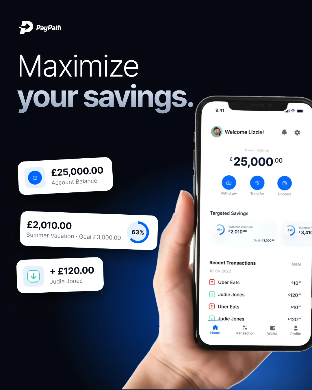
PayPath is a fintech app to manage a balance, save for goals and move money.
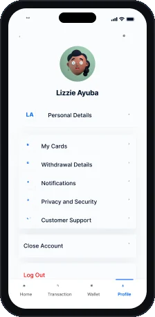
I designed the full mobile app: onboarding, OTP verification, login, PIN unlock, home, wallet, transactions and profile.
The challenge
Every tap counts.
- 01People send and save money every day, so these buttons can't hide in a menu.
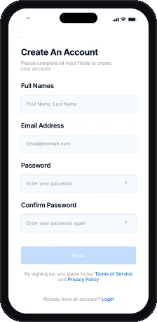
- 02Sign up needs OTP and a PIN, but must feel short.
- 03Goals and analytics had to fit one screen.
The approach
Balance first, patterns reused.
- 01The balance and three main actions lead the home screen.
- 02Sign up, OTP and login share one form and keypad.
- 03The wallet has a card carousel and a donut chart.
User flow
Ten screens, two journeys.
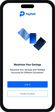
Six look-alike steps to get in, then four tabs.
Getting in
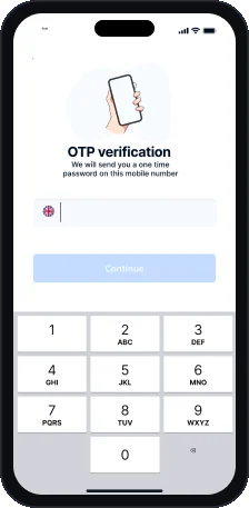
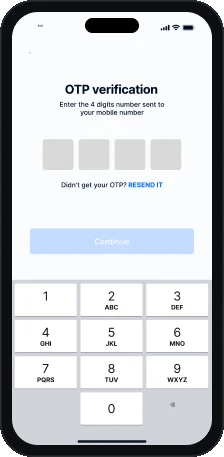
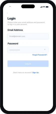
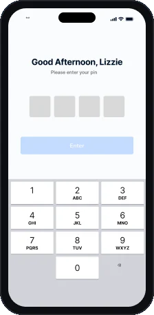
Everyday use
Key screen
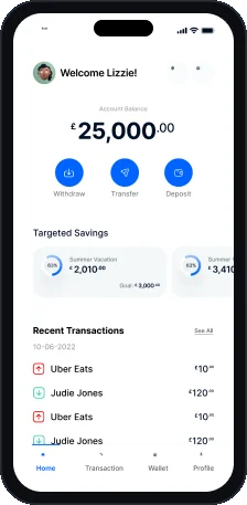
Home.
What users check most, in order.
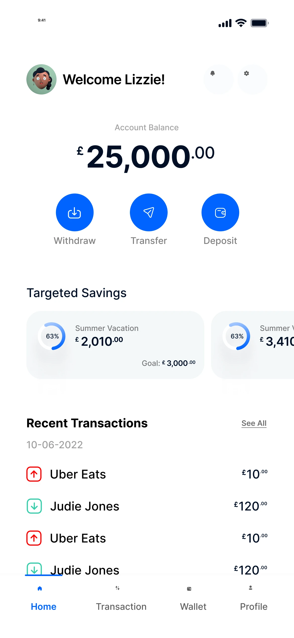
- 1Balance first
The balance is the biggest thing on screen.
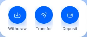
- 2Three core actions
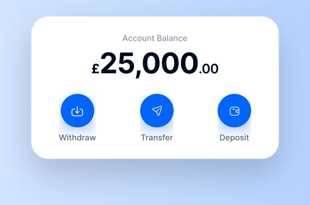
Withdraw, Transfer and Deposit sit under the balance.
- 3Targeted savings
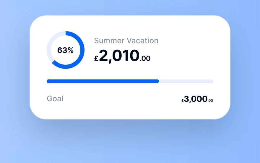
Goals scroll sideways with a progress ring.
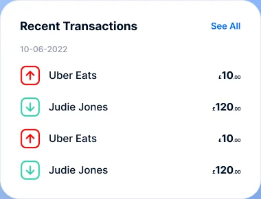
- 4Direction at a glance
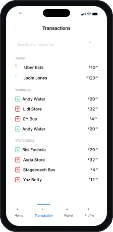
Red and green arrows show money out and in.
- 5Four tabs
Home, Transaction, Wallet and Profile.
Key screen
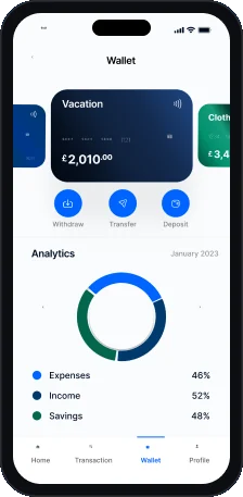
Wallet.
Savings pots are cards. Spending is one chart.
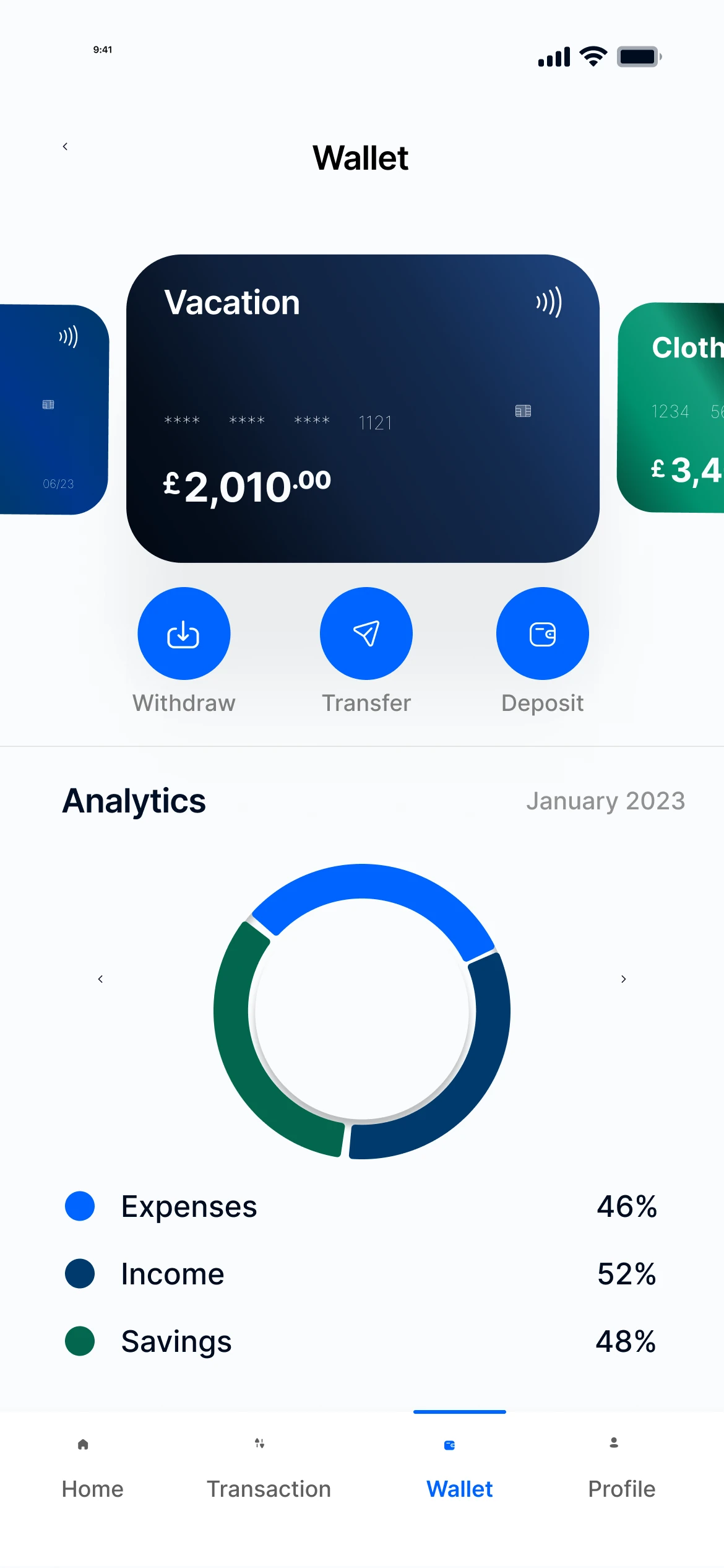
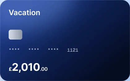
- 1Cards as a carousel
Each savings pot is a card you swipe.
- 2Same actions everywhere
The action row repeats from the home screen.
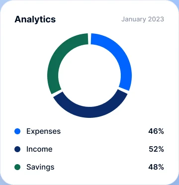
- 3Analytics donut
Expenses, income and savings in one ring.
- 4Readable legend
Each colour has a label and its share.
- 5Month by month
The header shows the month you are viewing.
Ui components
Built from reusable parts.
Cards, lists and the action row are shared across screens.
Visual language
Blues with a purpose.
Hot Blue drives every action. Green and red show money in and out.
- Hot Blue
#0064FF - Dreamy Blue
#80B2FF - Happy Blue
#DFECFF - Midnight
#000E24 - Success Green
#31D0AA - Error Red
#FF0000 - White
#FFFFFF
Typography
Typeface
£25,000
Inter
Inter in Bold and Medium for numbers, headings and body text.
- Medium
- Bold
Type scale
64 / 13
Inter
Six styles from H1 to Small, defined in the design file.
- H1 64
- H2 40
- H3 24
- Subtitle 18
- Body 16
- Small 13
Up close
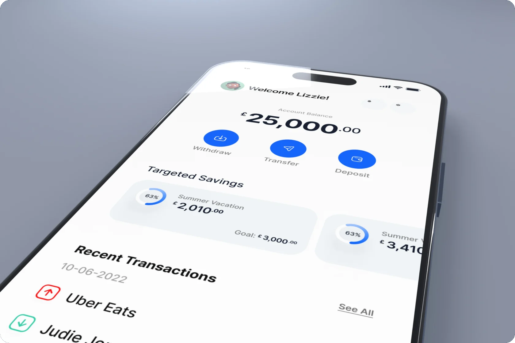
Crisp at every size.
A close-up of the app on iPhone.
Deliverables
What I delivered.
- User flow
- Onboarding and sign up
- OTP and PIN screens
- Home and wallet
- Transactions
- Profile
- Design system
- UI components
Want this kind of clarity for your mobile app?
Book a free 30 minute call. You leave with 3 written fixes, even if we don’t work together.
 Nafees ZulfiqarUsually replies within an hour
5.0 from 33 Upwork reviewsTop Rated