Logo
Tarabut
A logo for a brand that connects banks and apps.
- Industry
- Open banking, MENA
- Deliverables
- Logo, brand guidelines, launch visual, social posts
- Guidelines
- 27 pages, September 2023
- Scripts
- Latin and Arabic
Overview
As dependable as a bank, as open as the platform.
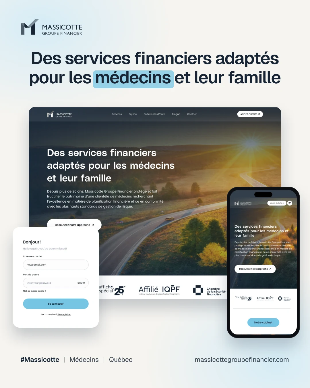
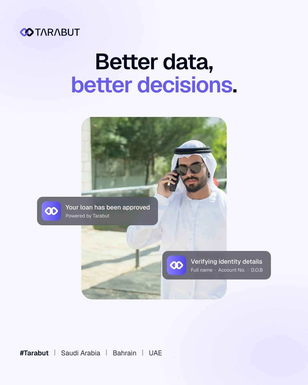
Tarabut connects banks, fintechs and their users across Saudi Arabia, Bahrain and the UAE.
I designed the logo and brand guidelines, including Latin and Arabic typography and the launch and social visuals.
The challenge
One mark for two scripts and many partners.
- 01It had to feel stable to banks and open to fintechs.
- 02Every rule had to work in Arabic and English.
- 03One system had to cover guidelines, launch visuals and social posts.
The approach
Two links, one connection, few rules.
- 01Two rounded shapes lock like a chain, a symbol for strong connections.
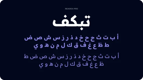
- 02Founders Grotesk for Latin, Readex Pro for Arabic.
- 03A small palette of purple, black, green and light tones.
The mark
Two links, one chain.
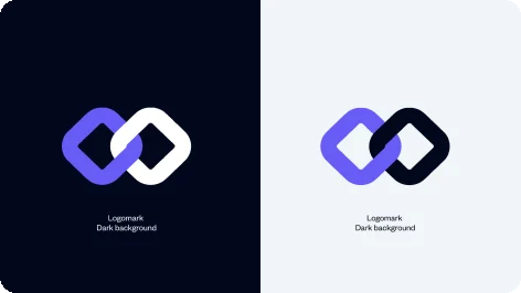
One link always stays Tarabut Purple.
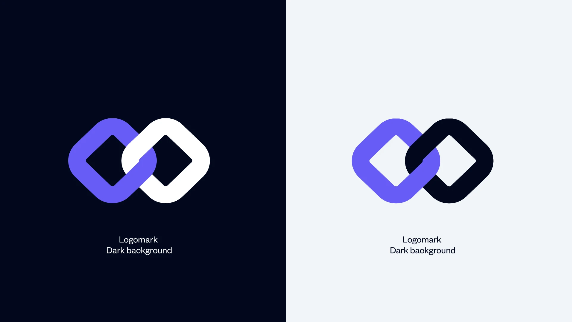
- 1The constant link
The first link is Tarabut Purple on every background.
- 2Light on dark
On dark backgrounds the second link turns white.
- 3Dark on light
On light backgrounds it turns Tarabut Black.
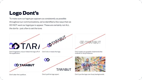
Guardrails
Rules that protect the mark.
What never to do with the logo.
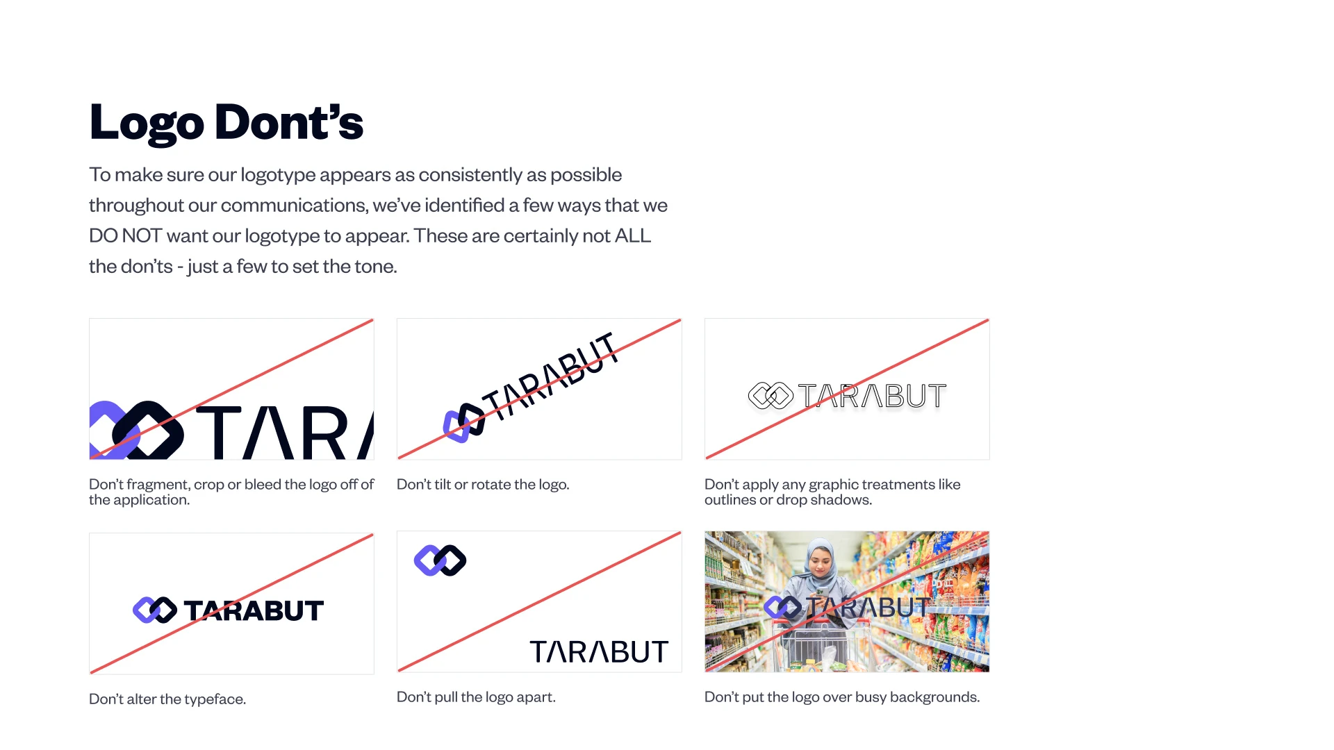
- 1No cropping
Don't split, crop or bleed the logo.
- 2No rotation
Don't tilt or rotate the logo.
- 3No effects
No outlines, drop shadows or other effects.
- 4One typeface
Don't change the wordmark typeface.
- 5Keep it together
Don't pull the logo apart.
- 6Clear grounds
Don't place it over busy backgrounds.
Visual language
A palette built around one purple.
Purple leads. Green adds a fresh highlight.
- Tarabut Purple
#675CF5 - Tarabut Black
#02081E - Tarabut Green
#69F7C3 - Tarabut Light
#FAF9FF - Tarabut Grey
#F2F5F7 - White
#FFFFFF
Typography
Latin typeface
Founders Grotesk
Headlines and body copy across the guidelines and launch material.
Arabic typeface
أ ب ت ث ج ح خ
Readex Pro
Paired with Founders Grotesk so every message reads with the same weight in both languages.
- Light
- Regular
- Medium
- SemiBold
- Bold
The guidelines
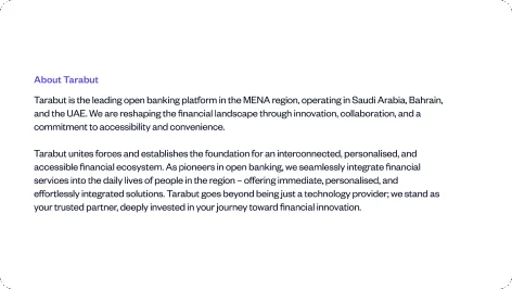
A 27 page brand book.
Each page answers one question a partner might ask.
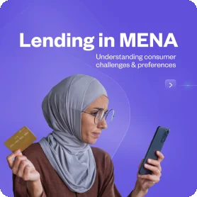
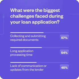
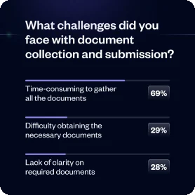
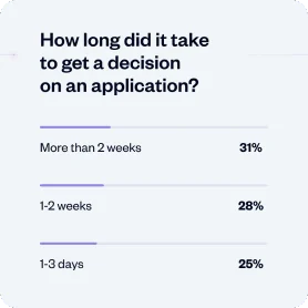
Applications
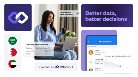
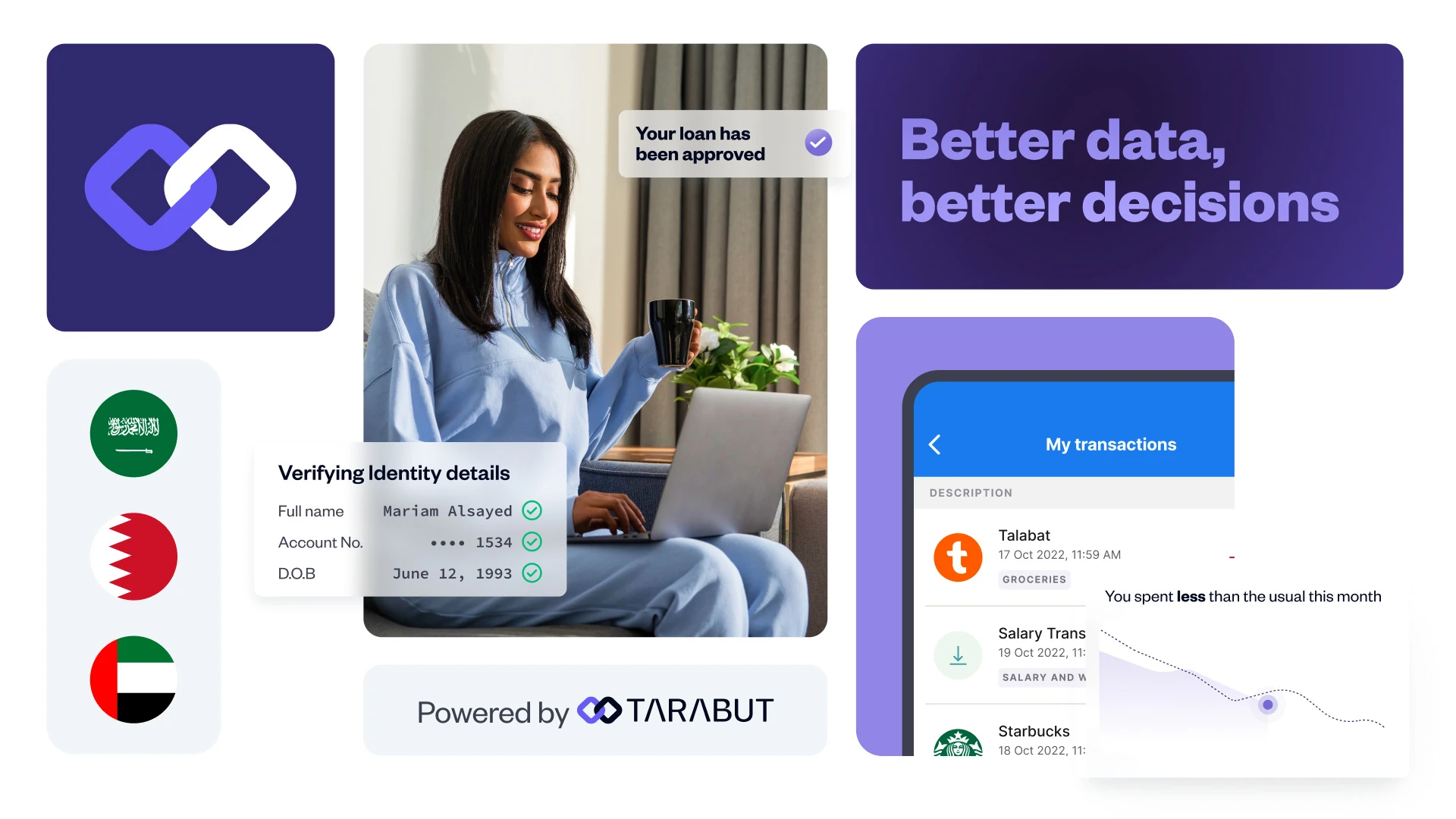
From launch day to social.
Same purple, black and white, so every piece is easy to spot.
Deliverables
What I delivered.
- Logo and logomark
- Brand guidelines
- Colour palette
- Latin and Arabic typography
- Launch visual
- Social media posts
Want this kind of clarity for your logo?
Book a free 30 minute call. You leave with 3 written fixes, even if we don’t work together.
 Nafees ZulfiqarUsually replies within an hour
5.0 from 33 Upwork reviewsTop Rated