Landing page
Easyline Express
A delivery company page where you can track a parcel right away.
- Client
- Easyline Express
- Location
- Markham, Ontario
- Deliverables
- Landing page, login and sign up popups
- Screens
- 4 desktop frames, 2 popups
Overview
Track a package before you scroll.
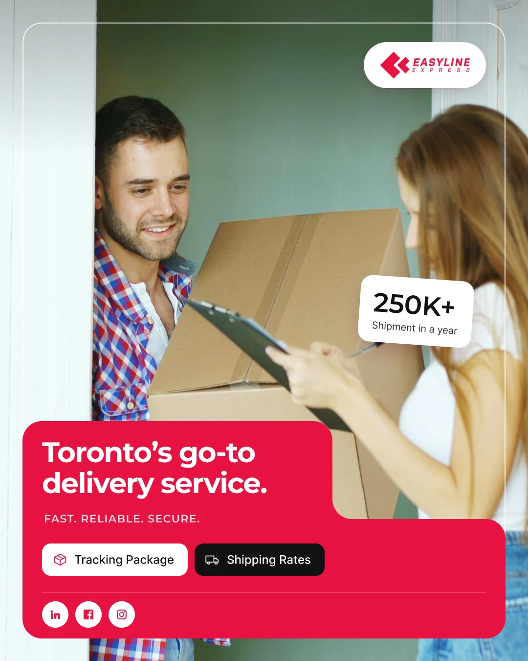
Easyline Express is a delivery company in Markham, Ontario. One page holds tracking, rates, specialty areas, the fleet and partner stories.
I designed the desktop landing page in two image variations, plus a login popup and a create account popup.
The challenge
Where is my package?
- 01People with a tracking number should not hunt for the field.
- 02New customers still need to see services, vehicles and proof.
- 03Five specialty areas, three vehicle types and partner stories, all on one page.
The approach
Tracking first, then short blocks.
- 01A tracking card with Tracking Package and Shipping Rates tabs sits on the hero photo.
- 02Ship Now, Get an Estimate and New Customers tiles sit under it.
- 03Red and white blocks take turns, one idea each.
Structure
One page, seven blocks.
The header and landing page sections.
Landing page
- HeaderServicesOur StoryLogistics SolutionsOur ApproachContact UsLocatorCareersLogin
- HeroTracking PackageShipping RatesShip NowGet an EstimateNew Customers
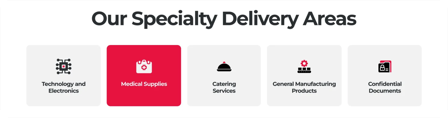
- Specialty areasTechnology and ElectronicsMedical SuppliesCatering ServicesGeneral Manufacturing ProductsConfidential Documents
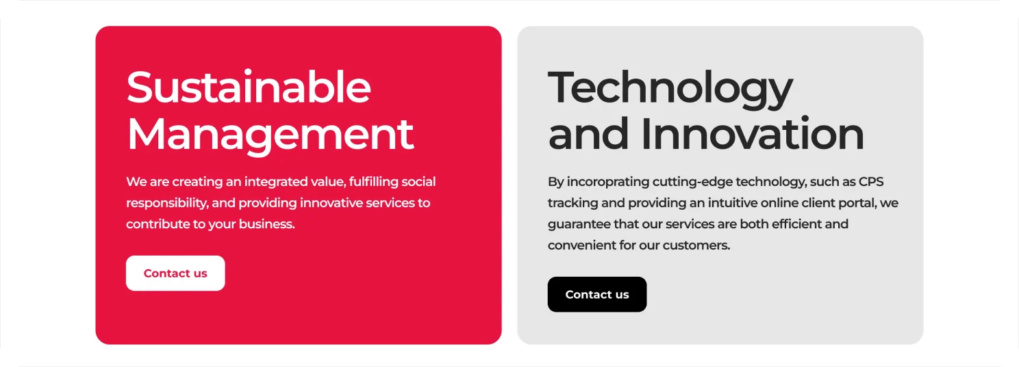
- CompanyEasyline Express OverviewSustainable ManagementTechnology and Innovation
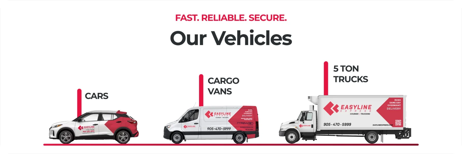
- FleetCarsCargo Vans5 Ton Trucks
- ProofPartner storiesNumbers Speaks
- AccountLogin popupCreate an account popup
Key screen
The hero.
Tracking and shipping actions come first.
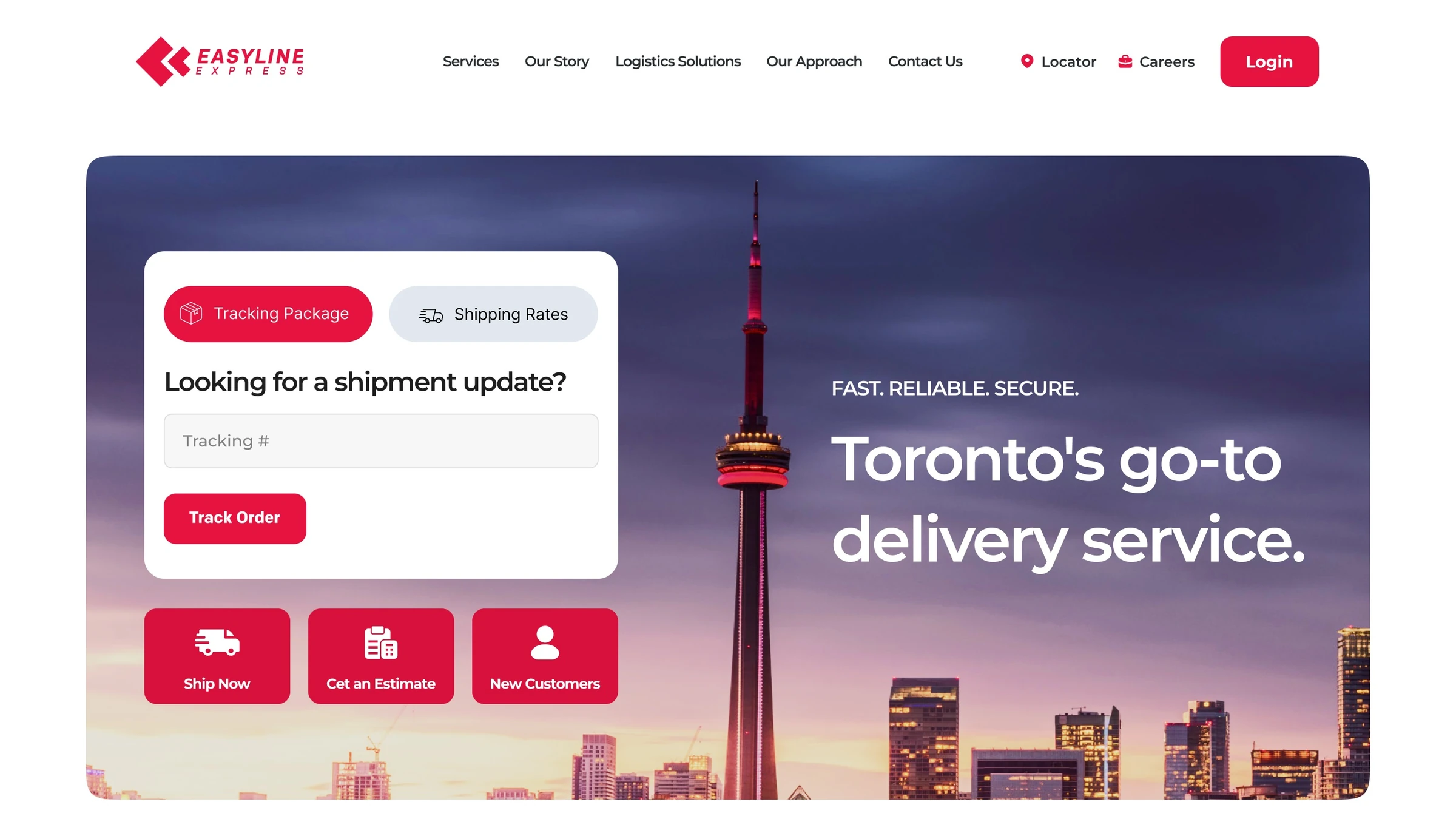
- 1Header
Five links, Locator, Careers and a red Login.
- 2Two tabs
Both tabs share one white card.
- 3Track Order
One field for the tracking number and a red button.
- 4Quick actions
Three red tiles for the main jobs.
- 5Local promise
Fast. Reliable. Secure. Toronto's go-to delivery service.
Key screen
The login popup.
It opens over a blurred page, so people keep their place.
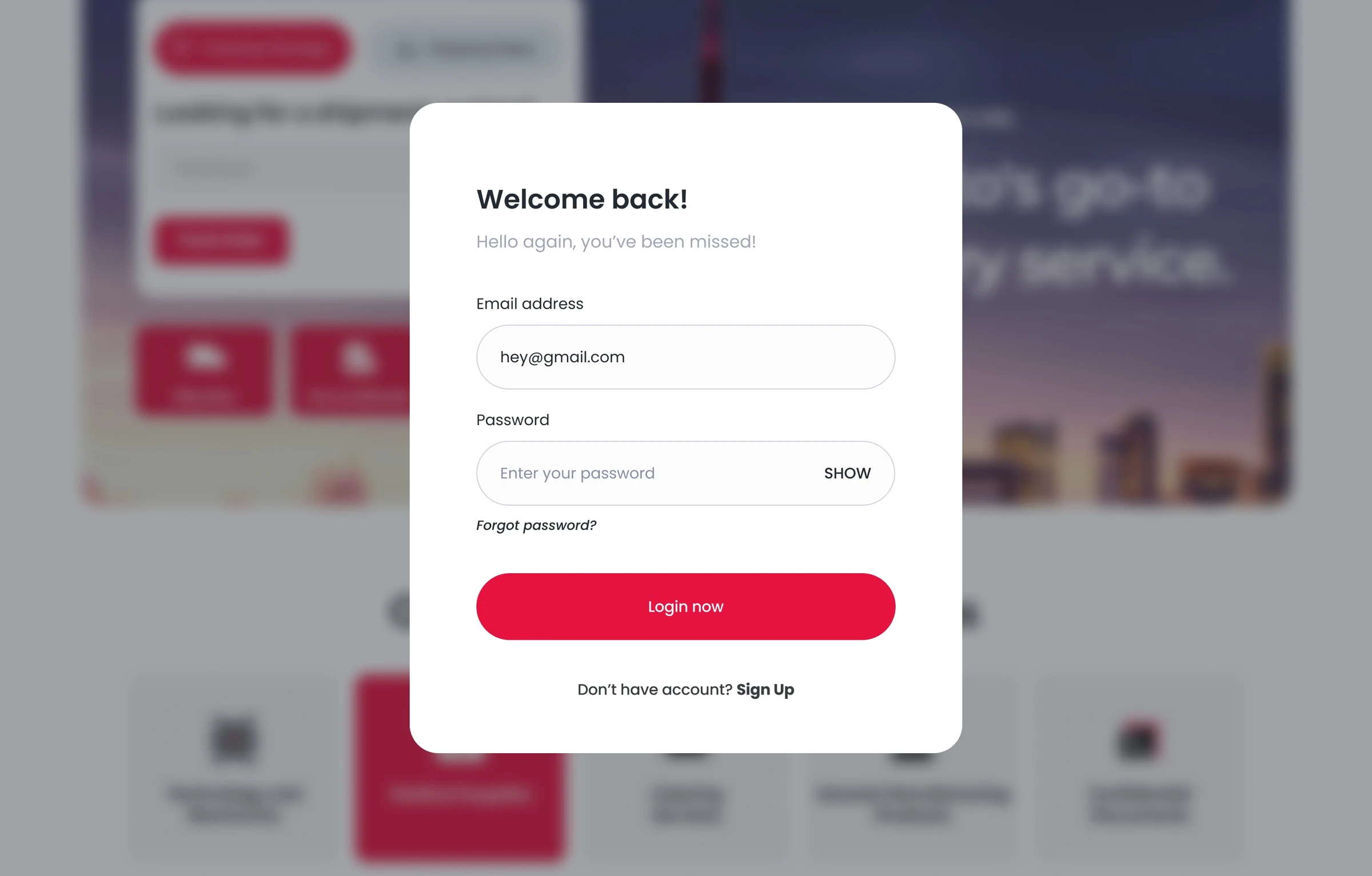
- 1Friendly welcome
Welcome back! plus one short line.
- 2Email address
A rounded input with an example inside.
- 3Password with SHOW
A toggle in the field shows the password.
- 4Forgot password?
A small italic link under the field.
- 5Login now
A full width red button.
- 6Sign Up
A link to the create account popup.
Page flow
The page, top to bottom.
One idea per block. Red marks the key one.
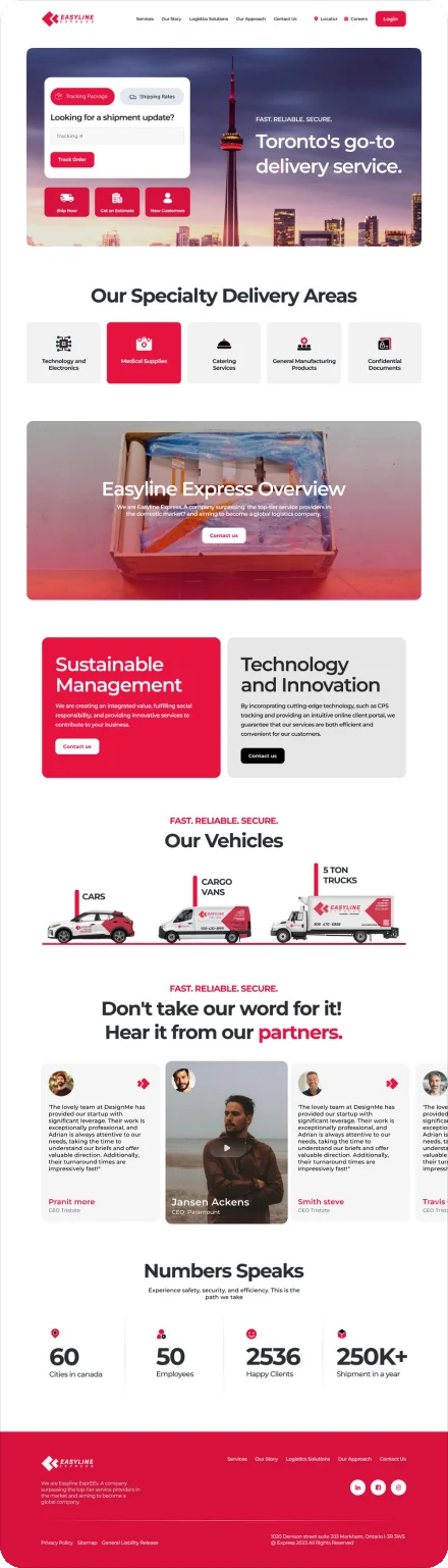
- 1Header
Logo, five links, Locator, Careers and Login.
- 2Hero
Tracking card, quick tiles, headline over Toronto.
- 3Our Specialty Delivery Areas
Five tiles, with Medical Supplies in red.
- 4Easyline Express Overview
A photo band, a short statement and Contact us.
- 5Sustainable Management and Technology and Innovation
Two cards side by side, one red and one grey.
- 6Our Vehicles
Cars, Cargo Vans and 5 Ton Trucks.
- 7Hear it from our partners
Partner quotes in a carousel, plus a video card.
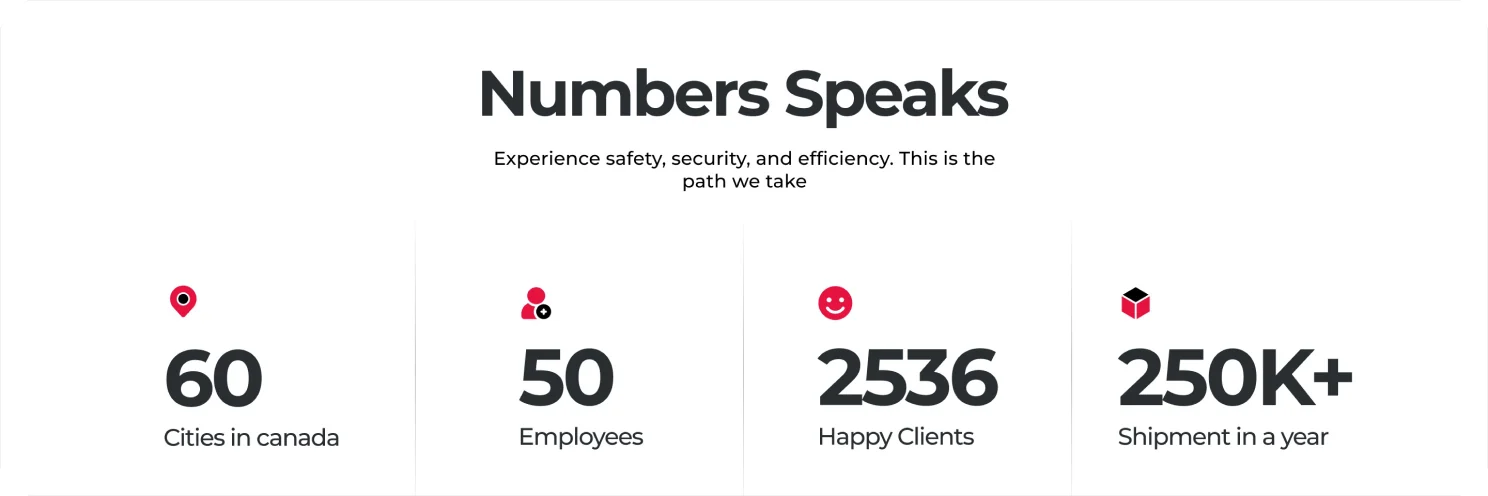
- 8Numbers Speaks
Cities, employees, happy clients and yearly shipments.
- 9Footer
Links, social icons and the address on red.
Key sections
Services, fleet and proof.
Tiles, two cards, fleet illustrations and numbers in one row.
Visual language
One red, used boldly.
Primary red is for every action. Greys do the rest.
- Primary
#E61341 - Deep Red
#D7113C - Dark
#292E33 - Black
#111111 - Grey
#F2F2F2 - Slate 100
#F1F5F9 - White
#FFFFFF
Typography
Headings
Aa
Montserrat
Headings, eyebrows and big numbers, in SemiBold and Bold.
- SemiBold
- Bold
Body
Aa
Inter
Body copy, navigation and card text.
- Regular
- Semi Bold
Popups
Aa
Poppins
Used in the login and create account popups.
- Regular
- Medium
Deliverables
What I delivered.
- Landing page
- Tracking card
- Specialty delivery areas
- Fleet section
- Partner stories
- Numbers section
- Footer
- Login popup
- Create account popup
- Two image variations
Want this kind of clarity for your landing page?
Book a free 30 minute call. You leave with 3 written fixes, even if we don’t work together.
 Nafees ZulfiqarUsually replies within an hour
5.0 from 33 Upwork reviewsTop Rated