Brand identity
NextStep Offices
A bold brand for a company that rents offices and meeting rooms.
- Industry
- Office spaces and memberships
- Deliverables
- Logo, app icon, brand applications
- Colours
- Electric purple, bright green, deep navy
- Applications
- 8 mockups on one brand board
Overview
A bold mark for a brand that rents workspace.
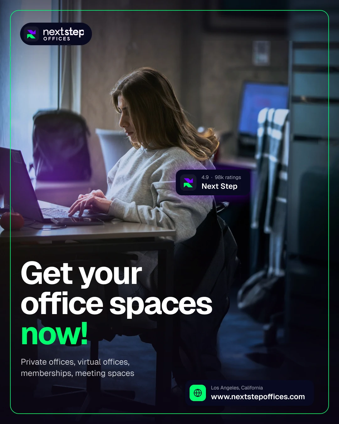
Next Step Offices rents private offices, virtual offices, memberships and meeting spaces. The logo needed to feel like movement.
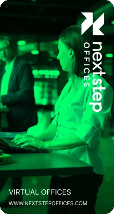
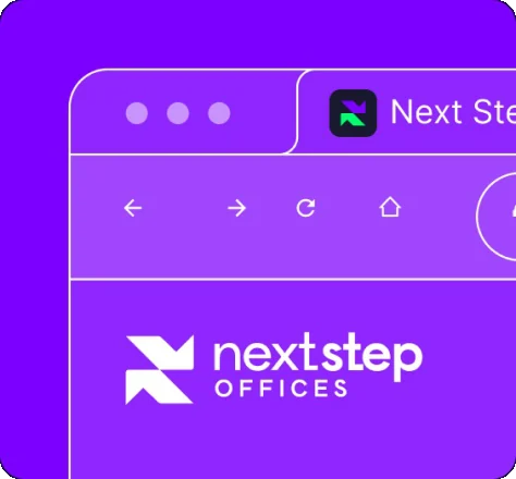
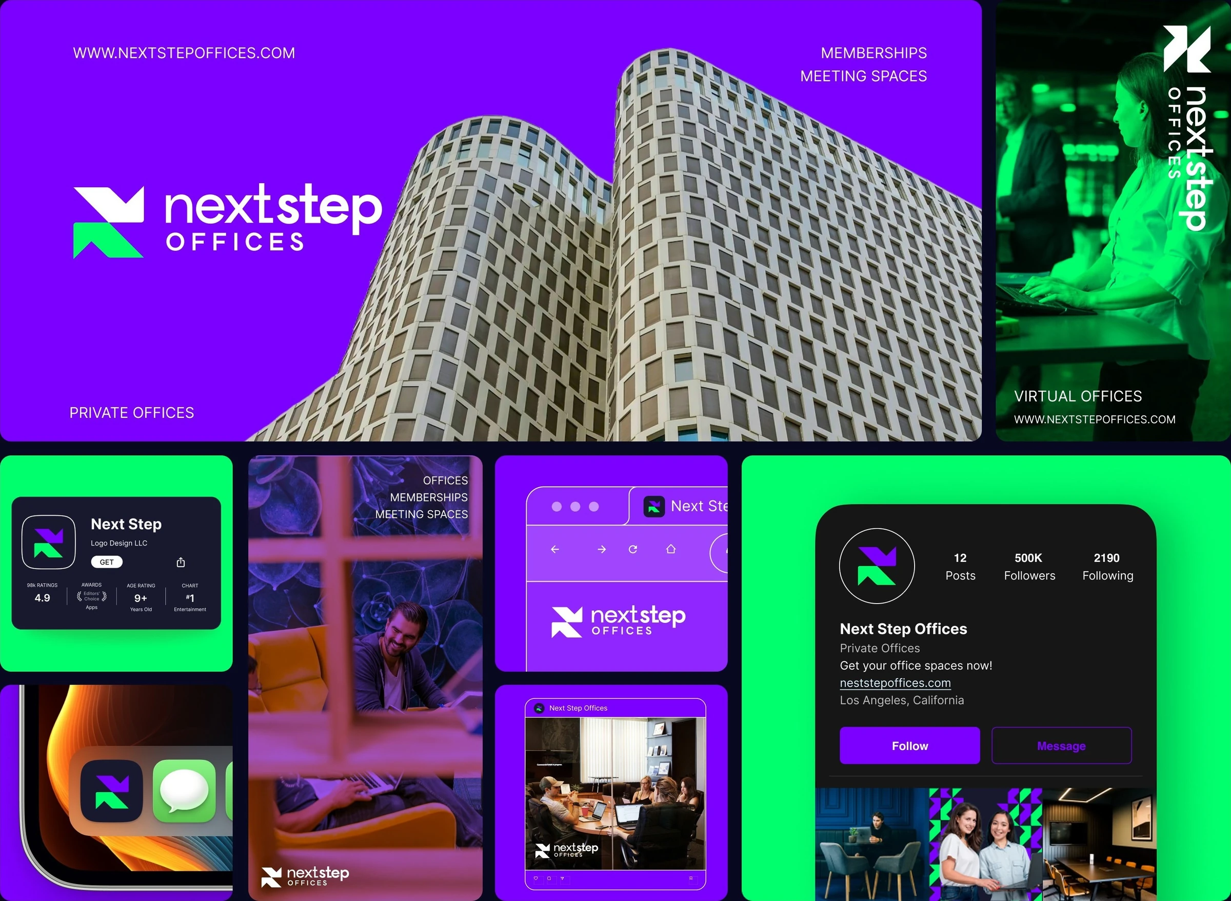
I designed the logo and showed it on a building banner, poster, app icon, App Store card, browser tab and Instagram.
The challenge
One name, four services, many sizes.
- 01The logo had to work from a big banner to an app icon.
- 02Four services all sit under one name.
- 03The brand had to stand out in a feed full of office photos.
The approach
Two shapes, two colours, one wordmark.
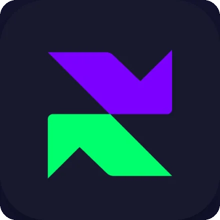
- 01A mark of two angled shapes that also works as an app icon.
- 02"next" is light, "step" is bold, and OFFICES is in spaced capitals.
- 03Purple and green as full backgrounds and as tints over photos.
The logo
Built from two steps.
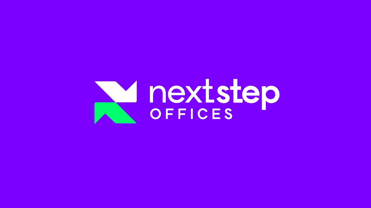
The lockup pairs the mark with a two weight wordmark and a descriptor.
- 1Upper shape
An angled shape with a notch, white on purple.
- 2Lower shape
The green shape mirrors it on one diagonal.
- 3Light "next"
The first half of the name is lighter.
- 4Bold "step"
The second half is heavier, so the eye lands there.
- 5Spaced descriptor
OFFICES sits under the name in wide capitals.
The mark in use
Small sizes, same shapes.
The mark recolours to purple and green on navy, or white and green on purple.
Visual language
Purple and green on deep navy.
Purple and green carry the brand. Navy and white keep it readable.
- Electric Purple
#7C00FF - Step Green
#00FF6D - Deep Navy
#080920 - Midnight
#18192E - White
#FFFFFF
Typography
Logotype
Custom wordmark
Drawn as outlines in the logo file. Two weights and a spaced descriptor in one lockup.
Supporting typeface
OFFICES
Inter
Used for service names, web addresses and the profile copy on every application.
- Regular
- Medium
- Semi Bold
- Bold
Applications
One board, eight touchpoints.
The board shows a building banner, poster, App Store, home screen, web and Instagram.
Deliverables
What I delivered.
- Logo and mark
- Vertical lockup
- App icon
- App Store card
- Web and browser tab
- Instagram post
- Instagram profile
- Brand board
Want this kind of clarity for your brand identity?
Book a free 30 minute call. You leave with 3 written fixes, even if we don’t work together.
 Nafees ZulfiqarUsually replies within an hour
5.0 from 33 Upwork reviewsTop Rated