SaaS Dashboard Design
SaaS dashboard design that people learn in minutes.
I design admin panels, analytics views and workflows for SaaS teams, so your users find what they need without a training call.
5.0 from 33 Upwork reviews · Top Rated · 100% Job Success
The problem
Signs your dashboard is costing you users
- 01New users sign up, look around once and never come back.
- 02Support keeps answering the same “where do I find…” questions.
- 03Every new feature adds another menu item, and the product feels heavier each release.
- 04Your sales demo needs someone to explain the screen before it makes sense.
The approach
How I make it clear
- 01Map who uses the product and the few tasks they come to do.
- 02Restructure navigation and pages around those tasks, not around your database.
- 03Design tables, filters, charts and empty states that answer a question at a glance.
- 04Build a component library so your developers ship new screens without new design debt.
What you get
Everything you need to build it.
- UX audit of the current product
- Information architecture and user flows
- Wireframes before visual design
- High-fidelity UI in Figma
- Dashboards, tables, filters and bulk actions
- Empty, loading and error states
- Onboarding, settings, billing and roles
- Component library and design tokens
- Clickable prototype
- Developer handoff and design QA
In more detail
How the work goes.
How a dashboard project runs
Most projects start with a short look at what already exists. I review your current screens, and any analytics, support tickets or demo notes you can share, to see where people get stuck. If you have no product yet, we start from the tasks your users come to do. A test account or a screen recording is enough to begin.
Next I turn those tasks into a page structure and a navigation. I draw wireframes before any colour or style, so we agree on the layout first. Then I design the high-fidelity screens in Figma, including the empty, loading and error states that are easy to forget. You can comment on the Figma file at any point.
When the screens are approved, I build the component library and design tokens and prepare the handoff for your developers. I stay available for questions and design QA while they build. The price is fixed in writing before work starts, and you pay in parts as each milestone is approved.
What makes a dashboard easy to read
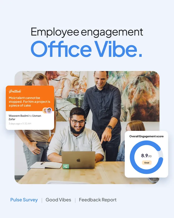
A dashboard should answer a question in a few seconds. The most important number comes first, and the detail is one click away. In the Office Vibe survey reports, each report opens with a large score, then a trend chart, then the breakdowns. A manager sees how a team is doing before reading anything else.
Structure matters as much as charts. Office Vibe has eight modules, from surveys and feedback to goals and settings, and they all sit under one sidebar. Predicted has two portals, one for restaurant owners and one for the admin team. Both use the same layout, so the product feels like one system.
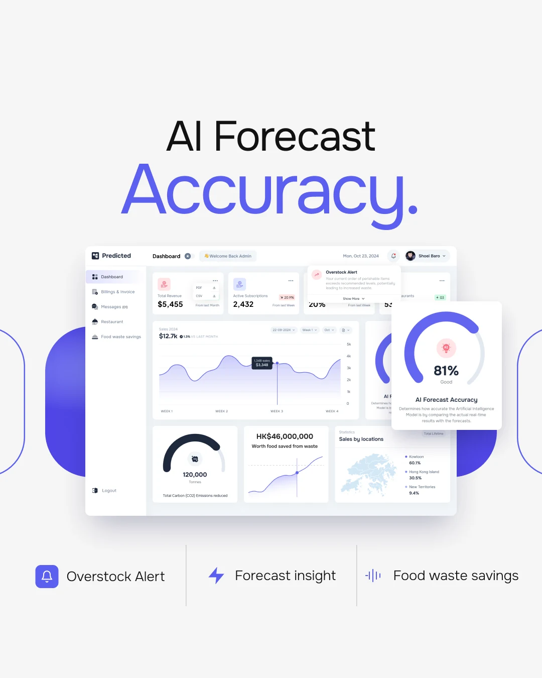
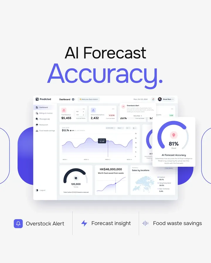
Alerts should arrive before the mistake, not after. In Predicted, an overstock warning shows above the first numbers, so a restaurant sees it before placing an order. Repeating the same cards, filters and buttons on every screen also helps. People learn them once and then stop thinking about the interface.
Dashboards I have designed
Office Vibe is an employee engagement product. I designed over 40 desktop screens, including reports, survey and goal builders, 1-on-1 agendas, settings and permissions.
Predicted is an inventory system for restaurants. It forecasts sales and warns about overstocked perishables. I designed the admin portal, the restaurant portal, billing, sign-in and a design kit.
Buildela is a marketplace that helps homeowners find the right builder. It is a private case study, so you can request access to see it.
The public case studies show the structure, the key screens and the reasoning behind them.
When to start with a UX audit instead
If you know users are leaving but not why, a redesign can turn into a guess. A UX audit finds the real problems first and ranks them by impact. Some clients then use the audit as the plan for the redesign. If you already know what is wrong, we can go straight to design.
Pricing
What it usually costs.
Every project gets one fixed price, agreed in writing before any work starts. You pay in parts as each milestone is approved. These are typical ranges; your quote depends on the exact scope.
Small
A few key screens
$1,850 to $2,600
Medium
One full product area
$4,600 to $6,500
Large
A complete product
$9,200 to $12,950
Who it’s for
Teams I usually help.
You work with me directly, with no agency or account manager in between. I work with clients worldwide and usually reply within an hour.
- Discover. A call to understand your users, your goals and where people drop off today.
- Design. Flows, wireframes and high-fidelity screens in Figma, where you can comment directly.
- Build. A clean handoff with components for your developers, or a live site built in Framer or WordPress.
- Launch. Final checks, launch support and improvements based on how real users behave.
Early-stage SaaS
You have a working product built by developers and it now needs to look and feel like a real product.
Growing teams
Features piled up over time and the dashboard needs a structure that can grow with you.
Internal tools
Your team works in an admin panel every day and it slows them down.

FAQ
Questions about SaaS dashboard design.
Other services
How much does SaaS dashboard design cost?
It depends on how many screens and user roles there are. A few key screens usually start around $1,850, and a complete product costs more. You get one fixed price before any work starts. Use the estimator on the pricing section for a quick range.
Do you work with our existing developers?
Yes. I hand off organised Figma files with components, states and specs, and I stay available for questions and design QA while they build.
Can you redesign only part of the product?
Yes. Many projects start with the area that hurts most, such as onboarding or the main dashboard, and continue from there.
Do you need access to our product?
A test account or a screen recording is enough to start. Analytics or support tickets help me find where users get stuck.
Which tools do you use?
Figma for all design work, with a shared file you can comment on directly. Prototypes are clickable in Figma.
How long does a dashboard design project take?
It depends on the number of screens and user roles. I agree the timeline in writing before work starts, together with the fixed price and the milestones.
Will you design mobile layouts too?
Yes, when the product needs them. Tell me which screen sizes you need and they go into the quote.
Do you design dark mode for dashboards?
Yes. I design dark mode for dashboards when the product needs it. Tell me early so it goes into the components and the quote.
Do you sign an NDA?
Yes. I sign an NDA before you share a private product or unreleased screens.
Do you build the dashboard as well as design it?
I design it and hand it off to your developers. If you need a working front end, I use no-code tools for it. I do not hand-write code.
Tell me about your project.
Book a free 30 minute call. You leave with 3 written fixes, even if we don’t work together.
 Nafees ZulfiqarUsually replies within an hour
5.0 from 33 Upwork reviewsTop Rated