Guide
Fintech app design, explained.
What a money app has to get right, shown through PayPath, a fintech app I designed, from sign-up to the wallet.
5.0 from 33 Upwork reviews · Top Rated · 100% Job Success
What makes a fintech app different
Money apps ask for trust early. Before people see a single feature, they hand over a phone number, wait for a code and set a PIN. Then they come back every day to check a balance or move money, so the buttons they need cannot hide in a menu. A fintech app has to feel safe and fast at the same time.
The example: PayPath
PayPath is a fintech app to manage a balance, save for goals and move money. I designed the full mobile app: onboarding, OTP verification, login, PIN unlock, home, wallet, transactions and profile, with a user flow, a design system and UI components. Below are the decisions that matter most, screen by screen.
A sign-up that feels safe and short
Sign-up needs a phone number, an OTP code and a PIN, but it must not feel long. In PayPath, sign-up, the OTP step and login share one form and one keypad, so every step looks familiar after the first one. The welcome screen leads with one clear benefit, forms are short with visible password rules, and the OTP step is a familiar one.
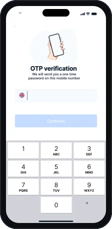
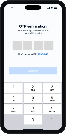
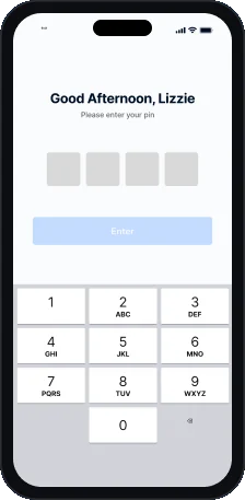
The lesson: you cannot remove security steps, but you can make them look and feel like one step repeated.
A home screen that leads with the balance
The home screen shows what users check most, in order.
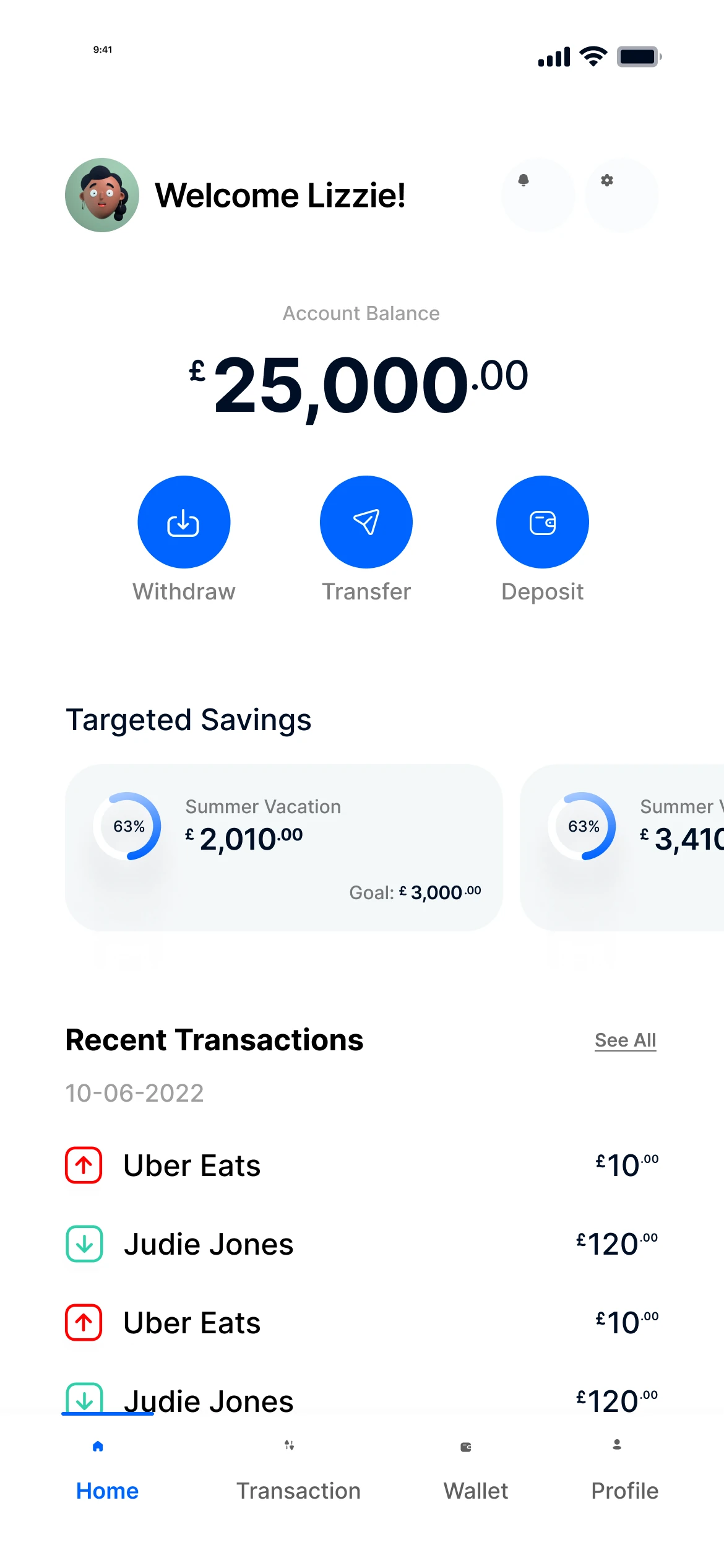
- Balance first: the balance is the biggest thing on screen.
- Three core actions: Withdraw, Transfer and Deposit sit under the balance.
- Targeted savings: goals scroll sideways with a progress ring.
- Direction at a glance: red and green arrows show money out and in.
- Four tabs: Home, Transaction, Wallet and Profile.
The lesson: the one number people open the app for goes first, and the actions they take every day are one tap away.
A wallet with one clear chart
The wallet turns savings pots into cards and spending into one chart.
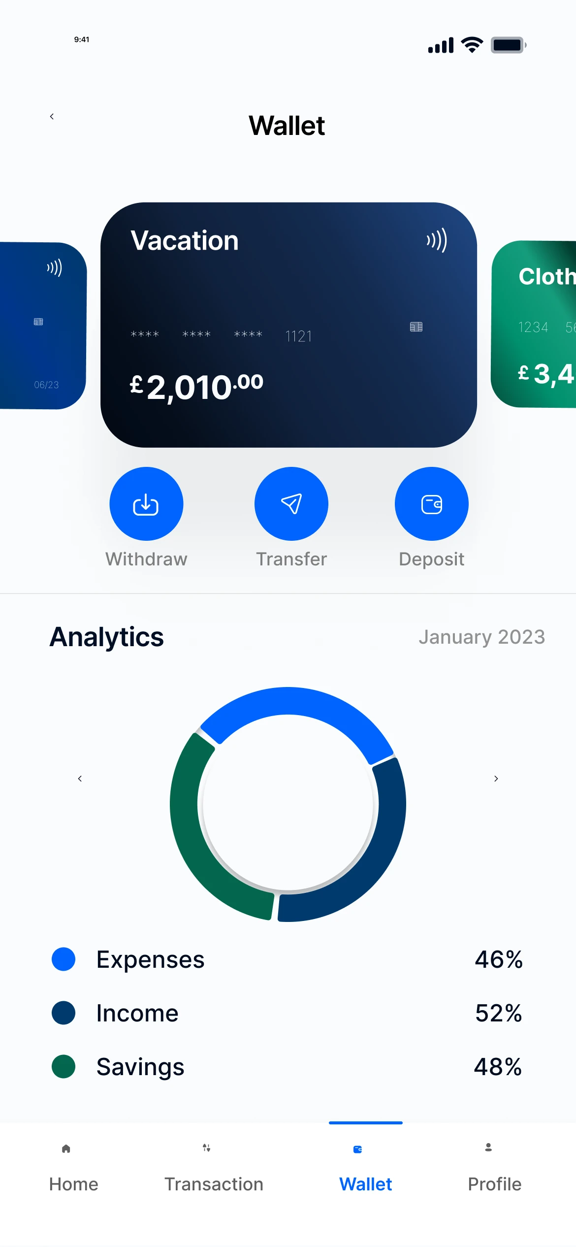
- Cards as a carousel: each savings pot is a card you swipe.
- Same actions everywhere: the action row repeats from the home screen.
- Analytics donut: expenses, income and savings in one ring.
- Readable legend: each colour has a label and its share.
- Month by month: the header shows the month you are viewing.
The lesson: one simple chart that people read in a second beats several charts they have to study.
Colour that means something
In PayPath, Hot Blue drives every action. Green and red only show money in and money out. Because the colours never change meaning, people learn them once and read every list faster after that.
Built from reusable parts
Cards, lists and the action row are shared across screens. That keeps the app consistent for users and makes it faster for developers to build, because each part is designed once and used everywhere.
A checklist for your fintech app
- Lead with the balance or the one number people open the app for.
- Keep core actions one tap away on the home screen, and repeat them where they are needed.
- Make verification look like one step. Reuse the same form and keypad for sign-up, OTP and login.
- Give colours one meaning each, and never reuse the money-in or money-out colour for anything else.
- Design reusable parts, so new screens stay consistent as the product grows.
See more
The full PayPath case study shows all ten screens, the user flow, the components and the colour system. If you are planning a money app, see my mobile app design services or read how much mobile app design costs.
FAQ
Questions about fintech app design.
What should a fintech app home screen show first?
The number people open the app for, usually the balance, with the most common actions right under it. In PayPath, Withdraw, Transfer and Deposit sit under the balance.
How do you make sign-up with OTP and a PIN feel short?
Make every step look the same. In PayPath, sign-up, the OTP step and login share one form and one keypad, so each step feels familiar after the first.
Which colours should show money in and money out?
Pick one colour for each and use it for nothing else. In PayPath, green shows money in, red shows money out, and blue is only for actions.
Do you design fintech apps for both iOS and Android?
Yes. I follow each platform's patterns where it matters and keep one design system across both.
Can I see the full project?
Yes. The PayPath case study on this site shows the user flow, every screen, the components and the colours.
Want a fixed price for your product?
Book a free 30 minute call. You leave with 3 written fixes, even if we don’t work together.
 Nafees ZulfiqarUsually replies within an hour
5.0 from 33 Upwork reviewsTop Rated